TypeScript and React: Styles and CSS
Is there any topic in the React space that has spawned more controversy than styling? Do everything inline vs rely on classic styles. There’s a broad spectrum. There’s also a lot of frameworks around that topic. I try to cover a couple, never all of them.
Most of them have their own, really good documentation on TypeScript. And all, really all typings have one thing in common: They rely on the csstype package.
In this section:
inline styles #
The easiest choice: Inline styles. Not the full flexibility of CSS, but decent basic styling at top level specificity. Every React HTML element has a style property that allows an object with all your styling. Objects can look like this:
const h1Styles = {
  backgroundColor: "rgba(255, 255, 255, 0.85)",
  position: "absolute",
  right: 0,
  bottom: "2rem",
  padding: "0.5rem",
  fontFamily: "sans-serif",
  fontSize: "1.5rem",
  boxShadow: "0 0 10px rgba(0, 0, 0, 0.3)",
};
They have roughly the same properties as the CSSStyleDeclaration interface.
When using React typings, these properties are already typed through csstype. To get
editor benefits, import types directly from csstype:
import CSS from "csstype";

const h1Styles: CSS.Properties = {
  backgroundColor: "rgba(255, 255, 255, 0.85)",
  position: "absolute",
  right: 0,
  bottom: "2rem",
  padding: "0.5rem",
  fontFamily: "sans-serif",
  fontSize: "1.5rem",
  boxShadow: "0 0 10px rgba(0, 0, 0, 0.3)",
};
And apply them:
export function Heading({ title } : { title: string} ) {
return <h1 style={h1Styles}>{title}</h1>;
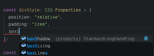
}Editor feedback is pretty good! You get Autocompletion on properties:
And documentation if you mis-type a value. (e.g. absolut instead of absolute)
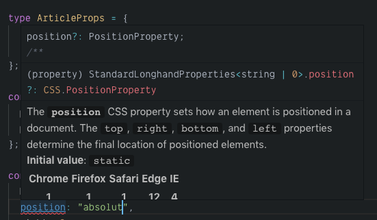
You don’t need any other plugins.
emotion #
Emotion – the one with the David Bowie Emoji 👩🎤 – is a pretty nice framework with lots of ways to add styles to your components. They also have a very good TypeScript guide. I give you a quick run-down, though.
Install emotion:
npm install --save @emotion/core
npm install --save @emotion/styled
Emotion has its own component wrapper, giving you a css property for elements
you can add styles to. Other than inline styles, these styles are added as a style
element on the top of the page. With proper classes and everything.
With its own component wrapper, you also need to swap out React.createElement for
their own jsx factory. You can do this on a global level in tsconfig, or per file.
For the course of this section, we do it per file. The css template function takes
CSS and returns an object you can pass to your components.
The properties are compatible with CSS.Properties from csstype. In fact, it uses
csstype under the hood.
/** @jsx jsx */
// the line above activates the jsx factory by emotion
import { css, jsx } from '@emotion/core';


const h1Style = css({
  backgroundColor: 'rgba(255, 255, 255, 0.85)',
  position: 'absolute',
  right: 0,
  bottom: '2rem',
  padding: '0.5rem',
  fontFamily: 'sans-serif',
  fontSize: '1.5rem',
  boxShadow: '0 0 10px rgba(0, 0, 0, 0.3)'
});

export function Heading({ title } : { title: string} ) {
  return <h1 css={h1Style}>{title}</h1>;
}
Roughly the same application, but the difference is significant: Styles in proper style elements, not attribute. The cascade is going to love you.
You also get the same type information as with CSS.Properties.
Since properties are compatible, you can easily migrate and use your old
CSS.Properties styles:
const h1Style = css({
  ...originalStyles,
  ...maybeMixedWithOtherStyles,
});
Handy! When you want to create styled components with emotion, you can use the styled
function. The same ground rules apply:
/** @jsx jsx */
import styled from '@emotion/styled';
import { jsx } from '@emotion/core';

const LayoutWrapper = styled('div')`
  display: grid;
  grid-template-columns: repeat(auto-fill, minmax(300px, 1fr));
  grid-gap: 1rem;
`;

type LayoutProps = {
  children: React.ReactNode;
};

export function Layout({ children }: LayoutProps) {
  return <LayoutWrapper>{children}</LayoutWrapper>;
}
The element I create is an actualy div and gets all props from HTMLDivElement
(or the React Equivalent). Meaning that if you an styled("a"), you can pass
href properties.
If you want to have proper tooling support, install the Styled Components for VSCode extension. It works really well with emotion.
Styled Components #
Styled components, the one that got styling in react really going. It also has
an emoji 💅. And TypeScript support! TypeScript support comes through DefinitelyTyped:
npm install @types/styled-components
It works immediately:
import styled from "styled-components";

export const Heading = styled.h1`
  font-weight: normal;
  font-style: italic;
`;
You get typings directly out of the box.
You can constraint CSS properties to certain values if you like, or even pass custom properties to regular CSS properties. You need to explicitly type your styled component:
type FlexProps = {
  direction?: 'row' | 'column',
}

export const Flex = styled.div<FlexProps>`
    display: flex;
    flex-direction: ${props => props.direction};
`;

// use it like that:
const el = <Flex direction="row"></Flex>
All perfectly typed and autocompletion ready.
The official docs show you how to work with theming and properties.
Tooling support is available through: Styled Components for VSCode extension
Styled JSX #
Styled JSX is by Zeit and comes with the Next.js framework.
It goes its own route of providing scoped styles in style properties, without changing
anything to original components.
It also requires you to use a Babel plug-in. Which means you have to use TypeScript as a babel plug-in.
export function Heading({ title }: { title: string }) {
  return <>
    <style jsx>{`
      h1 {
        font-weight: normal;
        font-style: italic;
      }
    `}</style>
    <h1>{title}</h1>
  </>
}
When you use it like that, this will break. You need to add an ambient type declaration
file styled-jsx.d.ts:
import "react";

declare module "react" {
  interface StyleHTMLAttributes<T> extends HTMLAttributes<T> {
    jsx?: boolean;
    global?: boolean;
  }
}
Or you do the short cut:
npm install --save-dev @types/styled-jsx
There’s a nice VSCode plugin to get better tooling for styles in styled-jsx
Load CSS with Webpack #
With webpack, you want to import style files in your JavaScript, to make sure you don’t have any extra style files you might not need. You still write regular CSS or Sass.
To load CSS or Sass, Webpack comes with a couple of loaders:
You name it.
To make things work with CSS or Sass in Webpack and TypeScript, you also need to add ambient type declarations.
I call them css.d.ts or scss.d.ts.
declare module "*.css" {
  interface IClassNames {
    [className: string]: string;
  }
  const classNames: IClassNames;
  export = classNames;
}
declare module "*.scss" {
interface IClassNames {
[className: string]: string;
}
const classNames: IClassNames;
export = classNames;
}Both tell you that everything you export from a css or scss file is a string.
You don’t get any class names you can attach, but at least you can import styles:
import "./Button.css";If you want to get all the class names, and really nice auto-completion, drop the ambient files and include another loader: css-modules-typescript-loader
Demos #
Styling requires a bit of infrastructure. Here’s some demos to get you started.
- This Codesandbox has samples for inline styles, style imports, emotion and styled components. Yes! All of them!
- The ScriptConf website uses CSS imports and styled-jsx
TypeScript and React: Table of contents
- Getting Started
- Components
- Children
- Events
- Prop Types
- Hooks
- Render props and child render props
- Context
- Styles and CSS
- Further reading